Kon’nichiwa, I wanted to talk a little about architecture photograph as I rarely touch on the subject. I’m currently working on a comprehensive tutorial on how to tackle architecture photography and thought I’d share a quick tip to get you excited. The images below are from the first part of the tutorial where I talk about some of the first shots you’ll take. These are the low hanging fruit, the most common types of shots you’ll see out there. That doesn’t mean thought shouldn’t go into them and in fact, you should be deliberate about all of your photography.
[twentytwenty]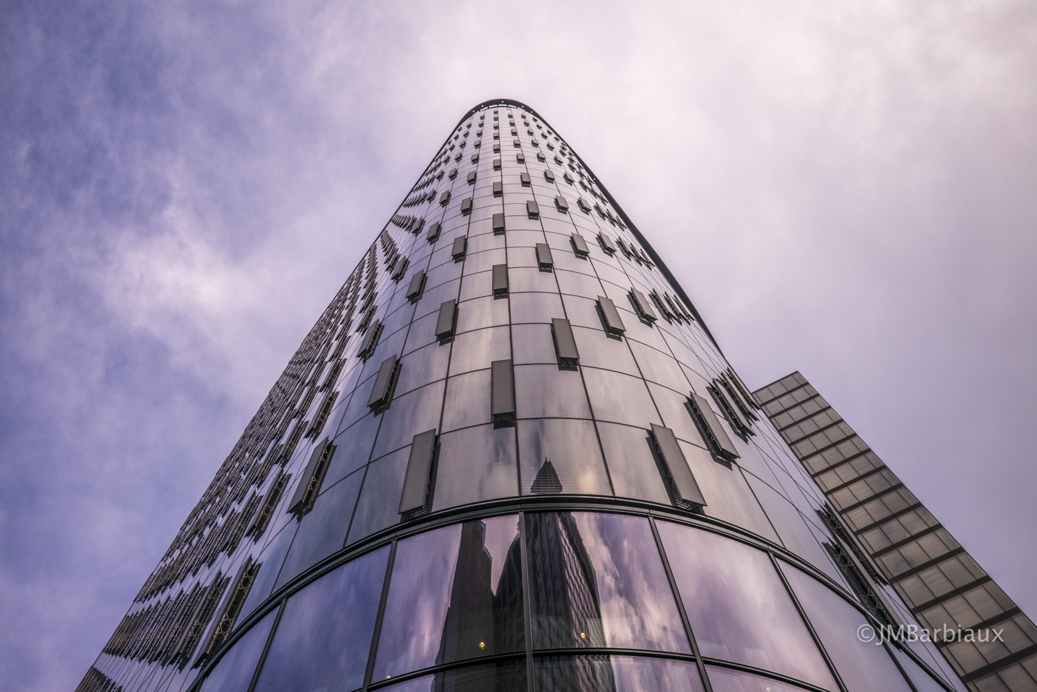
 [/twentytwenty]
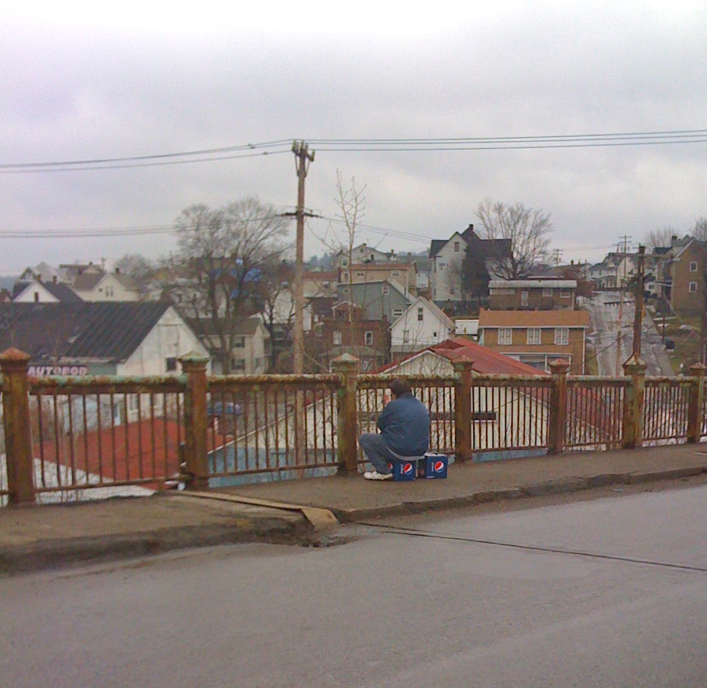
The first shots you take when dipping your toe into the waters of architecture photography are typically taken from the tourist position… This is where you stop in the middle of the sidewalk, lean back, drop your head back to the point where you feel as if you may tip backwards, and fill as much of your frame as possible with the building you found interesting. Usually these shots have the building right up the center of your frame as straight as can be. Sometimes this pays off and most of the time you create a rather ordinary looking image of some building that’s been photographed the same way a million times over. This is all well and good but if you put a little thought, a little deliberation, into your first shots you’ll walk away with something much more rewarding.
Tilt
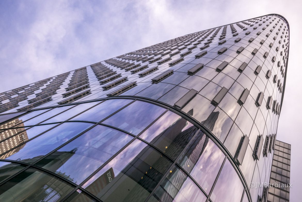
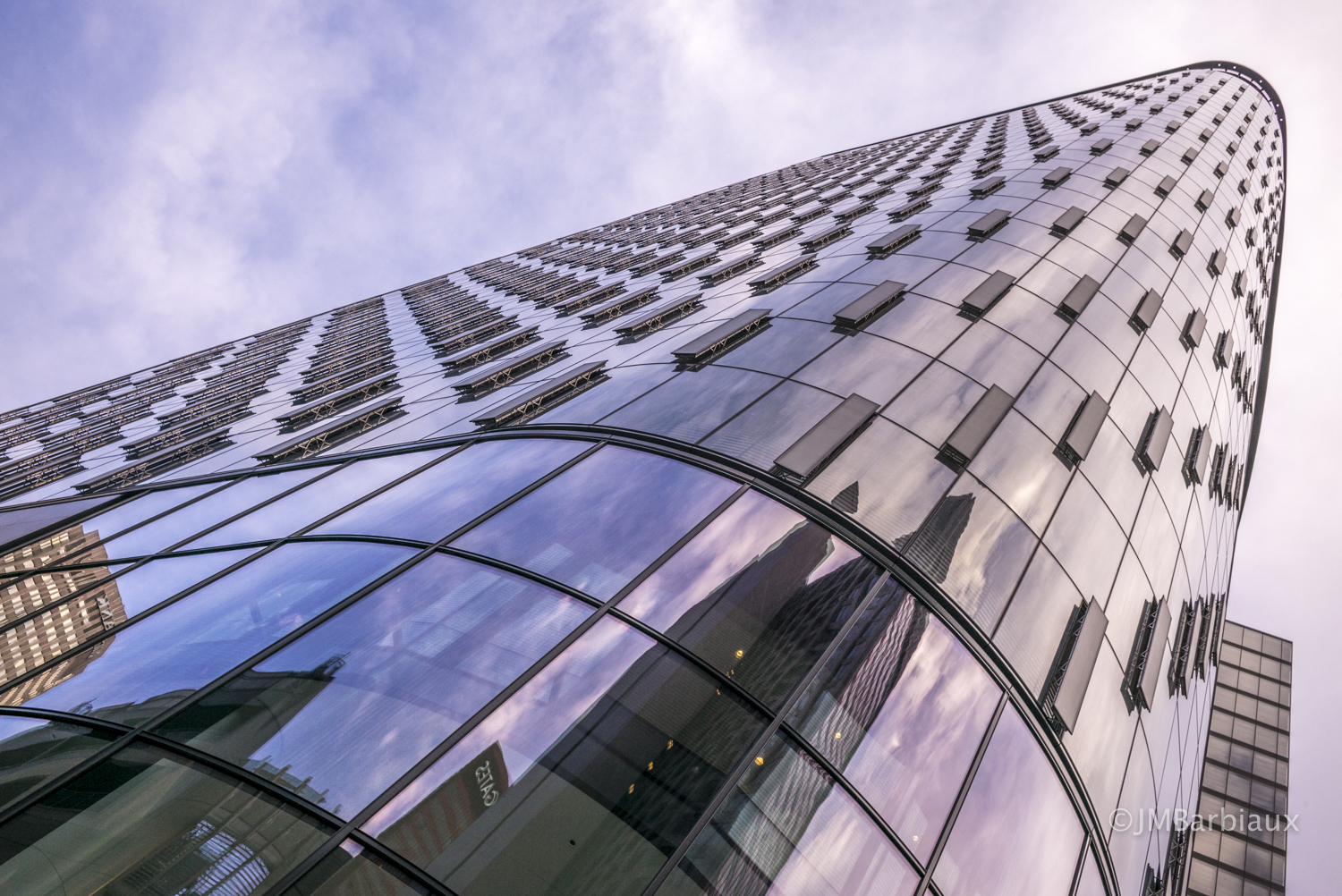
By tilting the camera and capturing the building in this way (featured image) I am able to fill more of the frame with the building and allow it to dominate the frame. Why don’t I want a more visually balanced image? Great question, emphasizing the hard lines and angles aside, although you can’t see the rest of the city in the frame you can see more of its reflection when I tilt the camera and this is significant for three reasons… First, it gives context and depth to the image. Second, and relative to the question of dominance, the reflections are all much shorter than the building making this image appear strong and dominant which is emphasized by its overwhelming presence in the frame. Finally, the reflections add depth to the image as well as a little softness to the hard lines that make up the majority of the image.
Also take note how when I tilt the camera and create this shot with the building tilted through the frame there are stronger patterns made with the panels that stick out of the building along the windows. The image with the building in the center does not capture this as well… You can see the lines but they look a bit clustered on the left side of the building. Once the building is tilted in the frame the pattern is emphasized and there are more leading lines created by the panels and the spaces between them that lead the viewers eyes through the frame.
Look for more architecture photography tips and tricks in the upcoming tutorial here on PhotolisticLife. Feel free to leave your thoughts in the comments section below.